Results
Matrix visualization
The core visualization shows each configured event as a bubble positioned based on:
- Y-Axis (Frequency of Use): Represents the number of times the event was performed, or the average daily usage depending on your aggregation setting (e.g., count, average per user).
- X-Axis (breadth): Indicates the percentage of Monthly Active Users who performed the event at least once during the selected period.
This visualization makes it easy to compare engagement across features and user segments.
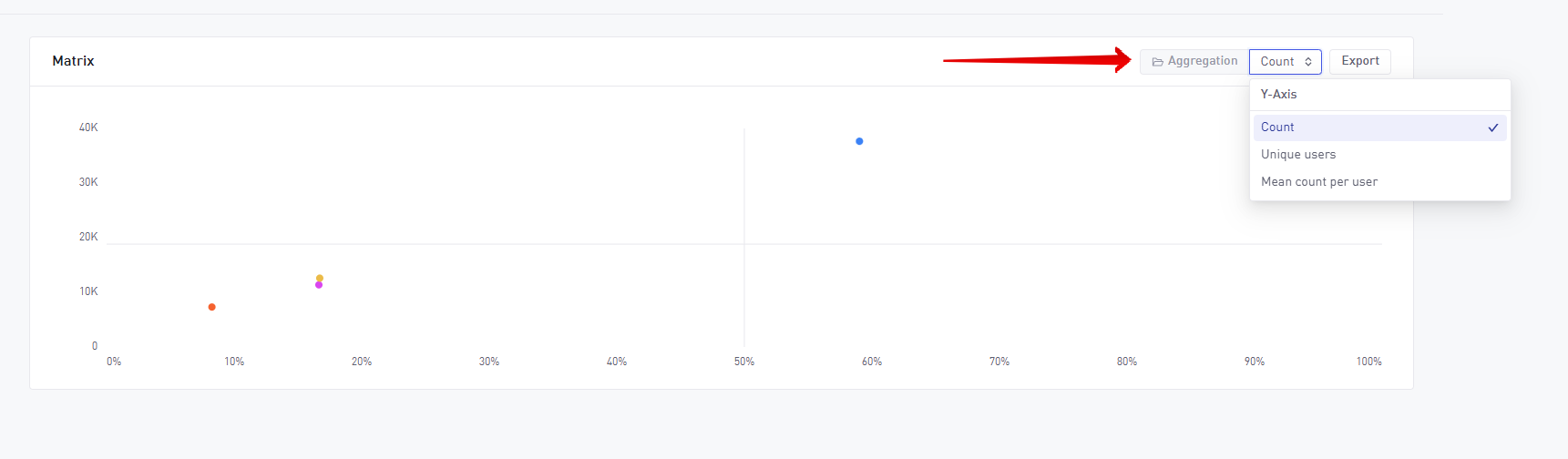
Aggregation options
Located just above the chart on the right, the Aggregation control allows you to choose how frequency is calculated:
| Aggregation | Description |
|---|---|
| Count | Number of total event triggers in the selected period |
| Unique user | Total number of unique users that have triggered the specified events |
| Average per user | Average number of events per user |
Exporting data
You can export the data behind the matrix by clicking the Export button. This is helpful for offline analysis, reporting, or creating custom visualizations outside the tool.